Week 1: Hosting
Week 2: Building
Indonesia produces 2.2× more renewable energy than Thailand, despite both showing growth over the period.
Week 3: Debate
Policy topic: Media emphasizes China, India, the US and the EU as top emitters. Does per-capita analysis change which countries bear primary responsibility for addressing climate change?
Finding: Per capita data exposes Qatar, the US, and Australia as top emitters, not China or India, revealing how aggregate metrics distort climate accountability narratives.
Week 4: Replication
Original chart: Carbon Brief produced this visualization tracking gender representation at COP climate conferences. The yellow-purple contrast distinguishes female and male delegates, with select meetings emphasized. Though the progression toward parity is evident, the visualization could be improved.
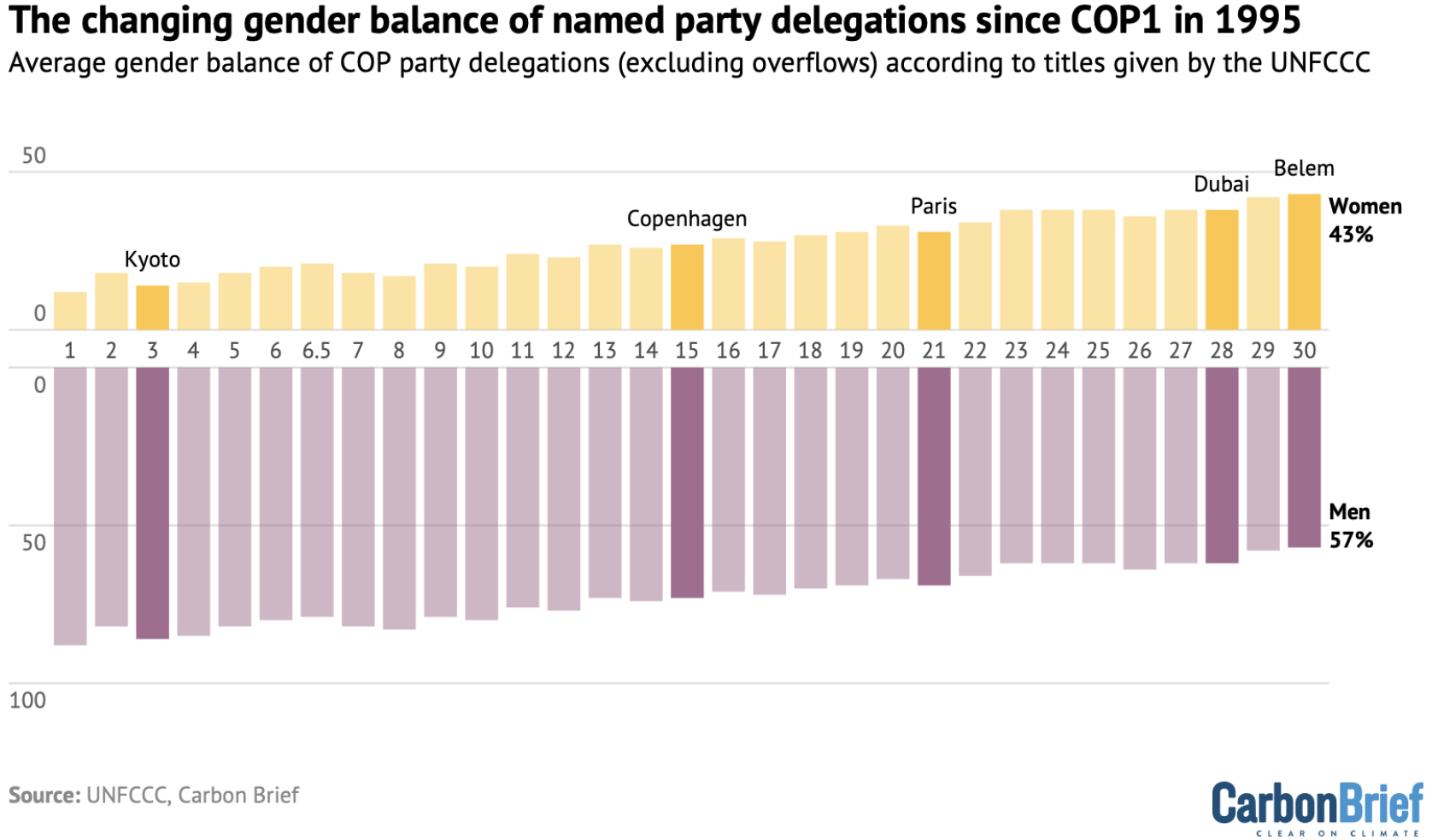
Replication: My version retains the original style, including the yellow-purple palette, highlighted COP meetings, and vertical bar structure. The underlying dataset was manually constructed by tracing values from Carbon Brief's published image, as raw data wasn't accessible.
Key improvements: I normalized gender percentages to a stacked 100% scale, added a 50% parity line to show progress, and revised the title to emphasize balance improvement.
Week 5: Accessing data: Scraper and API
Task (API): Creating a chart using live API integration.
This visualization showcases live API integration using Open-Meteo's Historical Weather Archive. The chart references the API endpoint directly in the Vega-lite specification, eliminating manual data downloads.
• Base endpoint: https://archive-api.open-meteo.com/v1/archive
• Location: latitude=14.6042&longitude=120.9822
• Time period: start_date=2014-01-01&end_date=2024-12-31
• Weather variable: daily=temperature_2m_max
• Timezone: timezone=Asia/Manila
• Complete URL: https://archive-api.open-meteo.com/v1/archive?latitude=14.6042&longitude=120.9822&start_date=2014-01-01&end_date=2024-12-31&daily=temperature_2m_max&timezone=Asia/Manila
This approach enables dynamic data loading. The visualization fetches updated JSON data each time the page loads, maintaining currency without manual updates.
Task (Web Scraping): Scraping a website, cleaning and normalizing the data, and exporting it into TIDY format.
I scraped Wikipedia's renewable energy table using BeautifulSoup and pandas, filtered for six Southeast Asian countries, and reshaped to long format for visualization.
Week 6: Loops
Task: Using a loop to batch download different series as JSON files and another loop to embed multiple charts.
I batch downloaded temperature data across Southeast Asian cities using a Python loop to call Open-Meteo's API. I then used a JavaScript loop to embed all charts, demonstrating scalable visualization workflows for multi-location climate data.
Week 7: Maps
Wales Choropleth: I mapped PM2.5 air pollution across Welsh local authorities using a choropleth, revealing urban centers like Cardiff face highest concentrations while rural areas remain cleanest.
Scotland Coordinate Map: I mapped Scotland's operational renewable facilities using coordinate data, with interactive filtering by technology type revealing wind power's geographic dominance across the country.
Week 8: Big Data
I analyzed UK protein prices from the Long Run Prices Database (1988-2022), selecting per-kilogram meat items and tinned beans for fair comparison. After normalizing to price per 100g, I aggregated quarterly averages and calculated meat-to-bean price ratios. Beans cost five times less than beef, supporting economic accessibility of sustainable protein.
Week 9: Interactivity
I implemented a year slider to visualize how marine protection evolved geographically across the Coral Triangle from 1977-2019, showing spatial patterns in conservation progress.
I added a year slider and hover interaction to highlight individual country trajectories against the global average, enabling temporal comparison of protection performance.
Week 10: Advanced Analytics & Machine Learning
I applied linear regression to each country's marine protection trajectory, projecting to 2030 with 95% confidence intervals. Charts reveal significant gaps between current progress and international targets, quantifying required acceleration.
Hypothesis: Marine protected areas (MPAs) will cluster by national governance approach, with countries choosing either larger, multi-use areas with low no-take zones or smaller, strictly protected reserves.
Method: I applied K-means clustering to Coral Triangle MPAs using five standardized features: log area, age, protection intensity, IUCN strictness, and management plans. Elbow method identified four optimal clusters.
Finding: Four management groups emerged based on size and strictness, not geography. Malaysia uniquely showed a consistent national strategy with medium, high-intensity MPAs.
Data Sources & Code
Data Sources
- Richard Davies Library: rdeconomist.github.io/library
- Economics Observatory: economicsobservatory.com
- Our World in Data: ourworldindata.org/co2-emissions
- Carbon Brief: COP Delegation Analysis
- Open-Meteo Historical Weather API: open-meteo.com
- Wikipedia: Renewable Electricity Production
- StatsWales: Welsh Government Statistics
- UK Government Open Data: Scotland Energy Supply Locations
- Long Run Prices Database: Davies, R (2021), "Prices and inflation in the UK – A new dataset", Centre for Economic Performance, Occasional Paper 55
- World Database on Protected Areas: protectedplanet.net
Code & Analysis
- Week 5 - Web Scraping: View Python notebook
- Week 6 - Loops: View Python notebook
- Week 7 - Maps: View Python notebook
- Week 8 - Big Data: View Python notebook
- GitHub Repository: View all code and data
AI Disclosure: I used Claude AI as a coding assistant with data processing and visualization code development.